Develop a brand identity, packaging, and seasonal ad campaign for a small chocolate confection shop located in Springfield, MO.
After meeting with the client, two brainstorming sessions were conducted to develop an initial concept The original logo was created on a chalkboard and scanned into the computer for digitization. Once client approval of the branding concept was received, the brand mark was refined, stationery and a brand style guide was created. The client requested to expand on the original ask to include packaging and seasonal advertising concepts.
Choko is a brand built on high-quality, ethically sourced, fair-trade chocolate. You won't find any chef created chocolate bonbons here. They are stripping off the gold wrapping paper in favor of a direct and transparent chocolate experience catered to discerning chocolate connoisseurs. Chocolate comes in two forms— bars or chunks. Both of which are made in-house daily. Their chocolate artists often combine cocoa with unique and unexpected ingredients from around the world to create rustic delicacies to delight the tastebuds and have you craving for more!The Choko logo expresses a balance between playfulness and stability.
The rustic hand-drawn primary wordmark bounces off of the baseline created by the secondary wordmark.
The texture of the primary wordmark gives of the impression that someone could have written it in chocolate with their finger. The color palette is made up of brown, beige, and white to communicate dark, milk and white chocolate. Recycled Kraft-Tone paper is used for the company stationery because of its rustic natural color and texture. The two-sided business card remains white for quick and easy readability.

No frills here, the bag is bold, minimalistic, and recyclable. Two packaging examples are below. The first is a gift tin filed with a pound of chocolate. The second is an in-store fillable package that has a space for employees to write down the weight, item number, and contents.


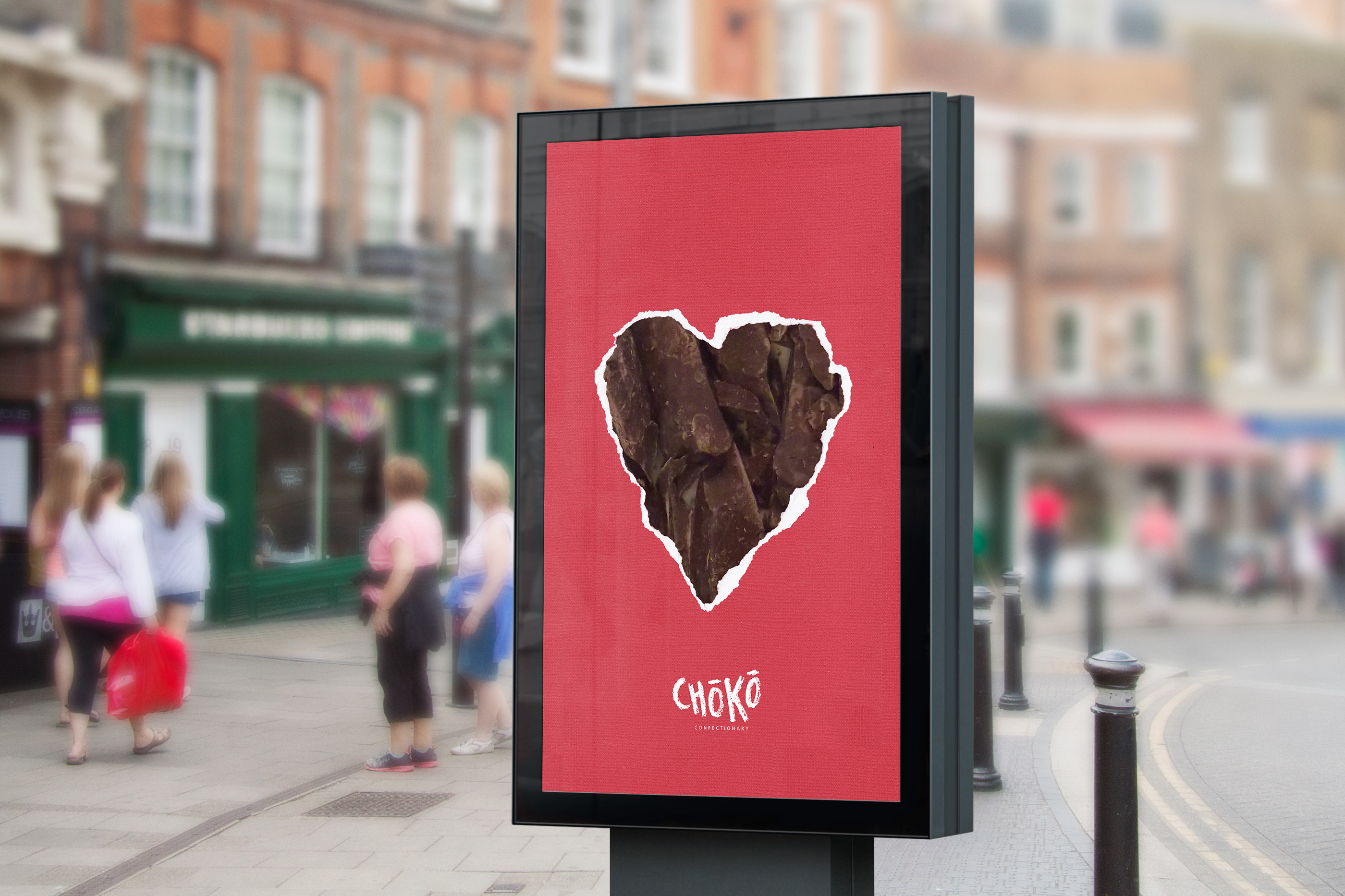
The seasonal ad campaign focuses on the excitement of unwrapping a gift received during the holidays. It expresses the vigor and enthusiasm one will have ripping open a package of Choko Chocolates.